
I'm trying this new thing--no, not test tiles, but taking pics of my test tiles after they're fired.

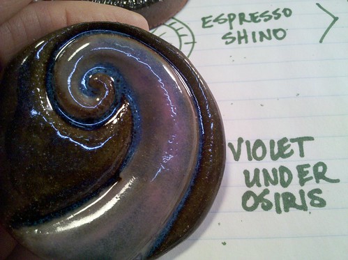
The other thing test tiles tell me is how a glaze is going to look over the kind of clay I use. Most commercial test tiles are done on smooth white clay to highlight the color of the glaze. I don't use white clay, I use a relatively dark red clay which has an effect on the color of the glaze. The "violet under osiris" tile, for example, shows this tendency. You can see that the violet comes through all right, but the osiris only looks blue where it's thickly applied, as in the crevices of the piece. Over the flat parts, it doesn't really look blue at all.
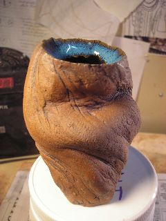
Sometimes, of course, it does look blue, as it does in this test piece:
See, this is why I love glazing. I love building relationships with glazes like this.
No comments:
Post a Comment